
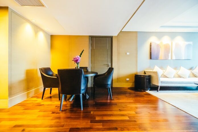

Hardwood color “trends” don’t behave like fast fashion. A floor stays in place for a long time, so the smartest choices follow a simple goal. You want a color that looks intentional today and still feels right when your furniture, paint, and lighting change.
When you look at what designers and homeowners consistently choose, a few evergreen patterns show up. People gravitate toward natural-looking wood tones, warmer neutrals, low-glare finishes, and textures that add depth without adding chaos.
The real trend that never goes out of style
Most high-end spaces aim for one thing. They create a calm foundation.
A calm foundation does three jobs at once.
- It makes rooms feel larger and brighter.
- It supports different design styles, from modern to traditional.
- It hides everyday wear better than extreme colors and shiny finishes.
Once you understand that, you can pick a hardwood color like a pro.
Color directions that stay relevant
Natural light oak and soft blonde tones
Light oak works because it plays well with almost everything. It pairs nicely with white walls, warm metals, natural stone, and modern cabinetry. It also helps offices feel cleaner and more open.
Use this direction when you want an airy space, a modern look, or a neutral backdrop for art and furniture.
Practical insight
Light floors can show dust in certain lighting. You can reduce that annoyance by choosing visible grain and a low-sheen finish.
Warm neutrals that feel inviting
Warm neutrals sit in the middle of the spectrum. They avoid the yellow look, and they avoid the cool gray look. Think warm beige, soft taupe, and gentle caramel oak.
These tones work especially well when you mix warm and cool elements in the same room, like white walls with warmer wood furniture, or black fixtures with cream textiles.
Practical insight
Warm neutrals handle mixed lighting better than cool tones. Many homes use daylight in the morning and warm bulbs at night, and warm neutrals look more consistent across both.
Mid-tone browns that read rich without going dark
Mid-tone brown hardwood gives you a classic, upscale look without the heavy mood of very dark floors. It also hides dirt and everyday scuffs better than very light floors in busy areas.
Use this direction when you want a cozy feel, a traditional look, or a “hotel lobby” level of polish for a home office.
Practical insight
Mid-tones often look the most “stable” over time because they avoid extremes. They also balance contrast better in open layouts.
Deep walnut-style tones used with intention
Dark floors still look beautiful, but they ask for more care and better lighting. Many people use them in focused spaces, like a study, formal dining room, or executive office, where the room benefits from drama and depth.
Practical insight
Dark floors show dust and fine scratches more easily, especially under direct sunlight. Choose a lower sheen and a subtle texture if you love the dark look.
Look at these color choices for inspiration.
Finish choices that shape the entire vibe
Color sets the direction, but finish controls the experience.
Matte and low sheen finishes
Low sheen makes wood look more natural. It also reduces glare from windows and overhead lighting, which matters a lot in offices.
A low sheen finish also helps hide small scratches and scuffs because light does not bounce off the surface as aggressively.
Satin for a balanced look
Satin gives you a gentle glow without the “shiny floor” effect. Many homeowners choose satin when they want a slightly richer look but still want forgiveness for daily life.
High gloss for showpiece spaces
High gloss can look stunning in the right setting, but it punishes real life. It highlights scratches, dust, and footprints. If you have pets, kids, or heavy office traffic, high gloss will test your patience.
Texture and character that look premium and clean easily
Texture adds depth, and it helps disguise minor wear. The trick is to choose a texture you can clean.
Subtle wire-brushed and lightly textured finishes tend to work well in both homes and offices. They hide micro-scratches, and they avoid the heavy grooves that trap dirt and pet hair.
Layout trends that work in both homes and offices
Wide planks for a calm, modern foundation
Wide planks reduce visual seams and make rooms feel more spacious. They also look high-end in open floor plans and large office suites.
Herringbone and chevron for statement zones
Patterned layouts create instant “designed” energy. They work best in specific areas, like an entry, a reception zone, or a hallway, where you want a visual moment without overwhelming the whole floor.
Practical insight
Use a pattern to create zoning in an office. A patterned reception area can feel premium, and a wide plank workspace can feel calm and focused.
How to choose the right undertone so the floor always looks right
This part makes or breaks the decision.
Step one: Match the undertone to your fixed finishes
Focus on what you will not change easily.
- countertops and backsplashes
- cabinetry
- large stone or brick features
- built-in woodwork
If those elements lean warm, choose warm oak and warm neutrals. If those elements lean cool, choose a more neutral natural tone and avoid heavy yellow stains.
Step two: Test samples in your real lighting
Lighting changes everything. Bring samples into the room, and look at them during the day and at night. Also check them next to your cabinet color and wall paint. This step prevents expensive surprises.
Step three: Choose a finish that matches your maintenance reality
If you want easy living, choose matte or satin. If you want shine, accept the extra cleaning and the higher visibility of wear.
Best color picks for offices that need style and function
Offices deal with rolling chairs, shoe grit, and frequent cleaning. They need a floor that looks professional and stays practical.
These color directions tend to work well:
- mid-tone warm oak for durability and warmth
- natural oak for bright, modern spaces
- warm neutral tones for a calm, upscale feel without the gray trendiness
Practical insight
Offices often use strong overhead lighting. Low sheen finishes reduce glare and eye fatigue, especially in open workspaces.
Bottom line
Evergreen hardwood choices follow a simple rule. Pick a natural-looking tone, choose an undertone that matches your fixed finishes, and keep the sheen low enough to live comfortably. When you do that, your floor supports your design instead of fighting it, whether you build a cozy home or a polished office.
